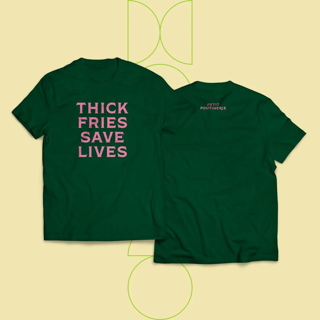
Thick fries save lives
The Poutine Truck is long standing institution in Rochester nightlife. Often found parked outside of bars or festivals, the founding ladies of the truck would chat with or playfully roast regular customers waiting for their fries, gravy and cheese curds. This was my introduction to them. It was kind of outlaw-ish, and exciting. In 2011, they pioneered how food trucks operated in the city of Rochester.
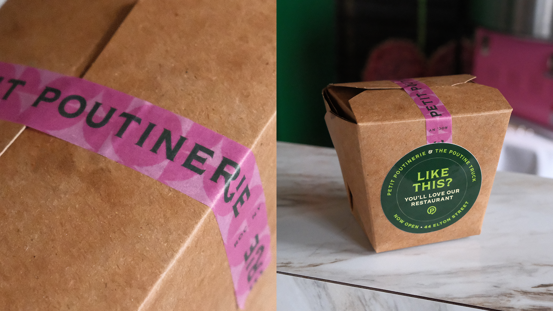
Fast forward 11 years, the nomadic business had expanded and team were opening their first brick and mortar, Petit Poutinerie. They needed a rebrand to reflect this change. After a strategy dive, it was decided that this rebrand would be focused on communicating the characteristics of fresh, driven and human.
DisciplinesBrand Identity
Art Direction
Layout
The inspiration for the identity came from a few sources. Playful mischief from the early years, and the concept of indulgence. Poutine is rich food, you can’t really eat all of the time. Let's be the devil on people’s shoulders. Inviting the audience to give into their desires and indulge. Be bad.
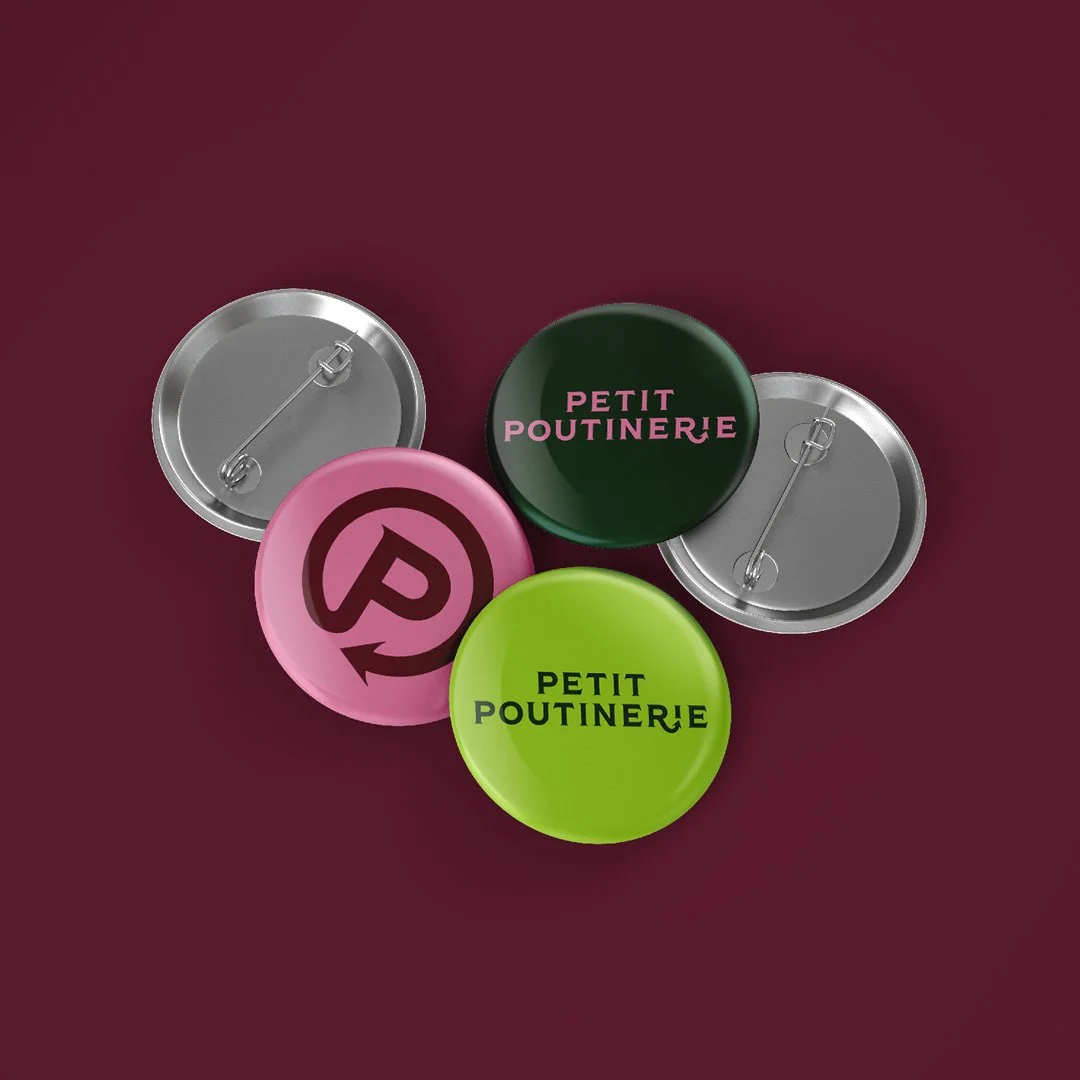
This plays out quite literally in the logo. The elegant and sharp edges of the typeface Shackleton, paired with a nod of mischief with the devil’s tail. Lastly the color palette was updated to feature an unapologetic feminine energy. Chef’s kiss.
PhotographyMatt Wittmeyer


