Bottling a brand
20 Deep is a winery located north west of the Finger Lakes region in central New York. The name is inspired by the depth vine roots will grow into the soil, while simultaneously speaking about their commitment to the surrounding community. But 20 Deep isn't just another snobby winery. This is an inclusive space that embraces connection. The people you’re with matter more than tasting notes.
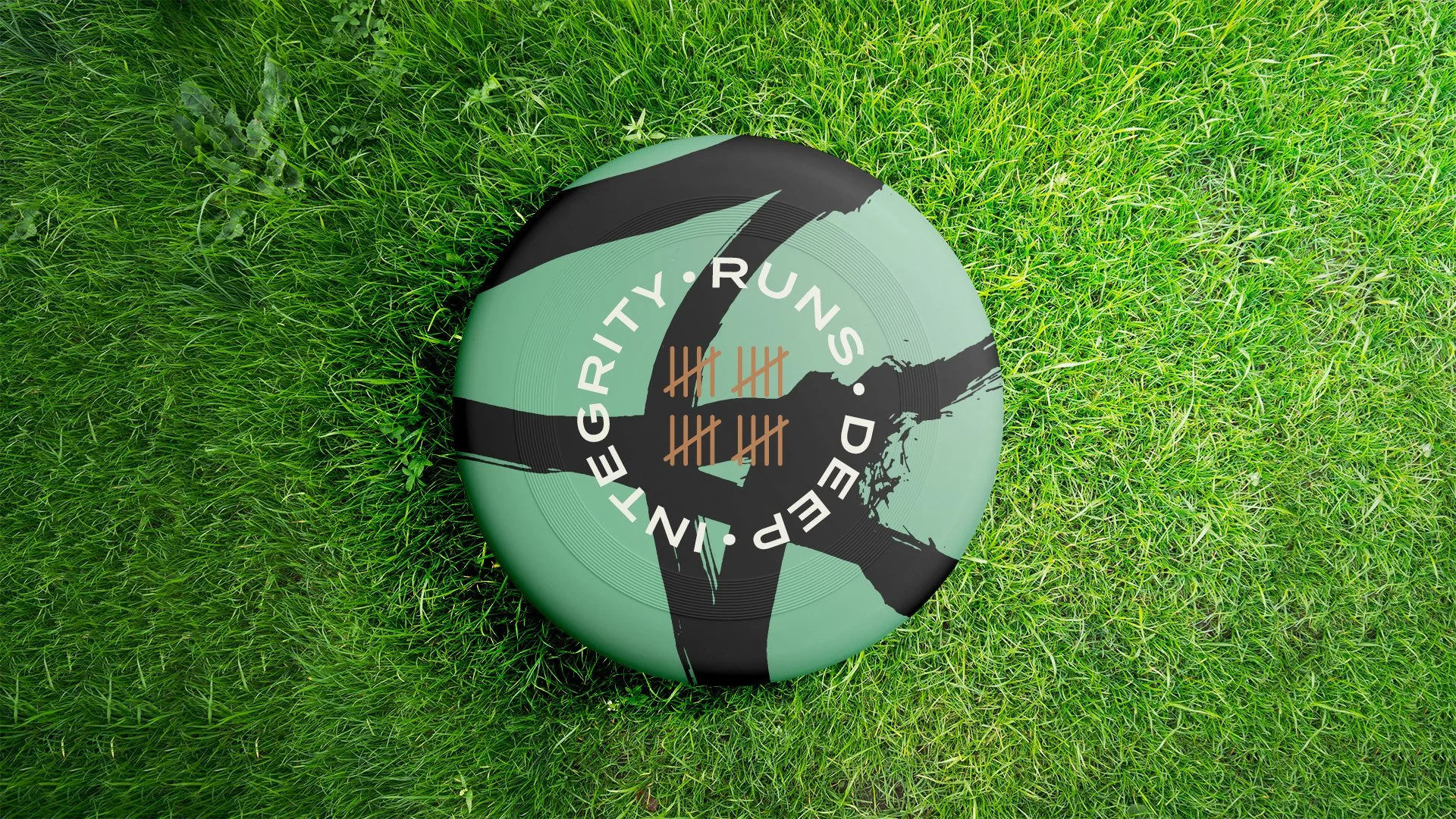
The visual backbone of this identity are expressive brush strokes. They quickly signal the level of craft poured into the wine making process. Also the human need to express one’s self, and connection. You see it everywhere throughout history. From cave paintings, to museum walls. Even in children’s art. Bold human marks connecting across time.
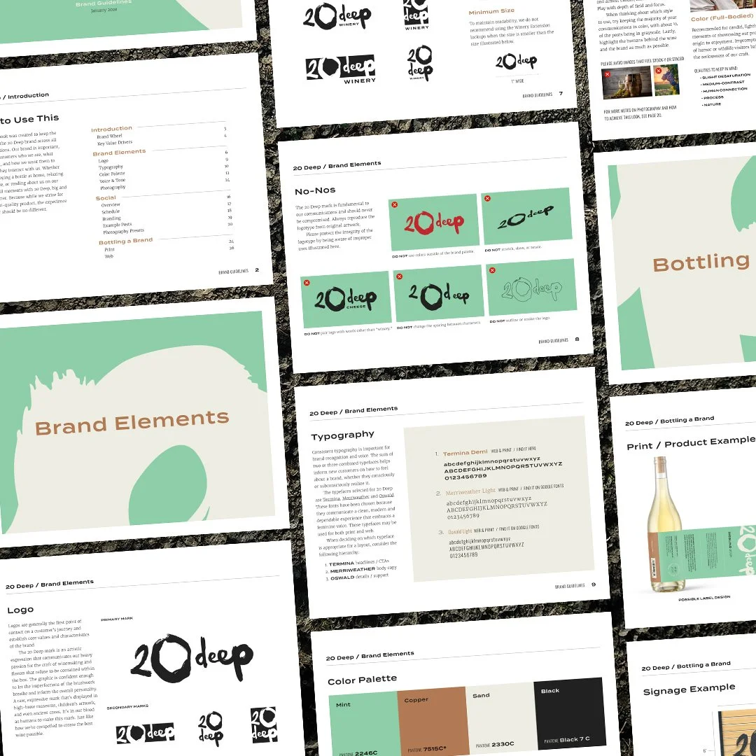
Paired with the clean and sturdy typeface Termina, and an understated earthy color palette, the brand adopts a tone that is knowledgeable and welcoming.
AwardsGraphis Design 24
DisciplinesBrand Identity
Art Direction
Packaging
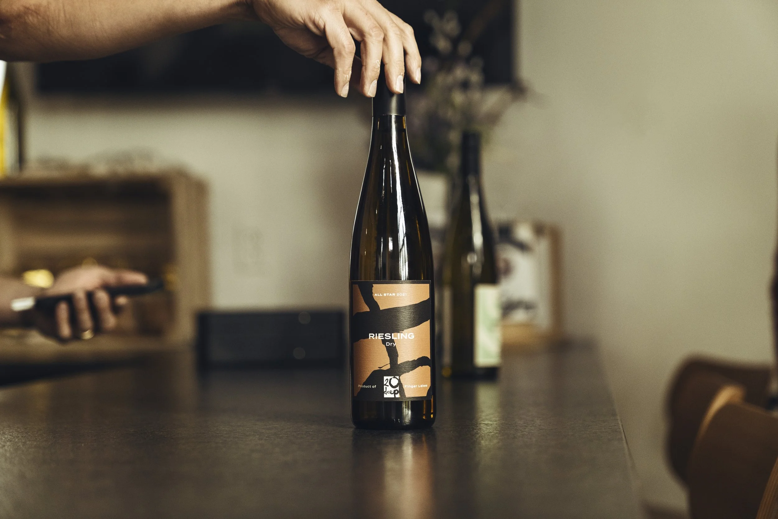
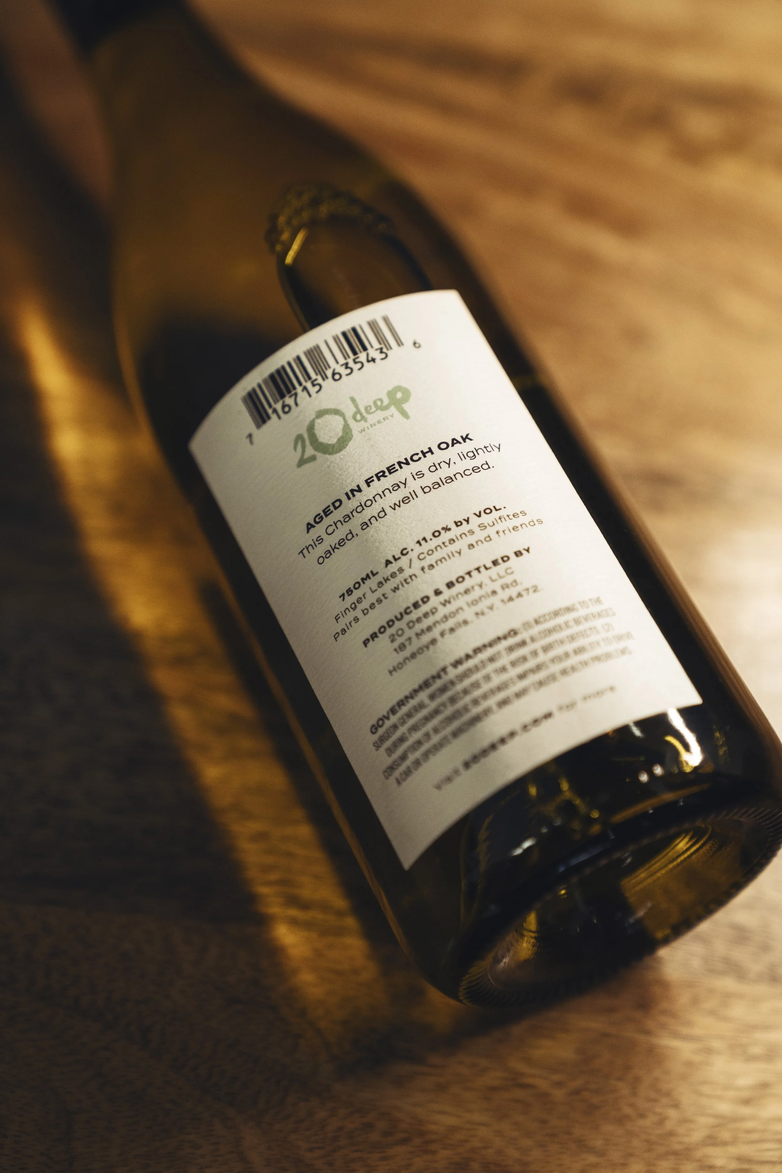
For the packaging, a tiered system was created to help customers navigate the product range. Organized into All Stars (the premium line), Rare Gems (limited editions), Remixes (experimental batches) and Mainstays (everyday table wines). Keeping the staff in mind, editable templates ended up being the best long term solution for the labels. They employ color and brush strokes as a tool for customers to identify the different tiers.
Lastly, the brand merchandise avoids simply placing the logo on t-shirts. Opting instead to elevate the brand to more of a lifestyle, with products that seamlessly fit into customers’ lives.
Additional credits:Naming: Alyssa Davis
Photos: Nue Chanthavongsay


